Thursdays with Amanda: Working with a Designer
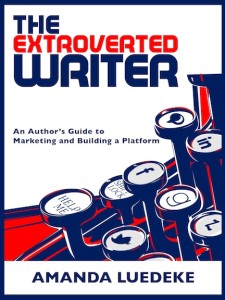
 Amanda Luedeke is a literary agent with MacGregor Literary. Every Thursday, she posts about growing your author platform. You can follow her on Twitter @amandaluedeke or join her Facebook group to stay current with her wheelings and dealings as an agent. Her author marketing book, The Extroverted Writer, is available from Amazon and Barnes & Noble.
On Monday, I posted the PDF designs of the business cards that I have been using to promote my book, The Extroverted Writer, at conferences. Now, in my book I talk a bit about working with a designer. And, coming from a marketing background in which a lot of the work we did involved print design, I do know a thing or two about making designers happy. But since having my cards made, I feel I have a lot more advice to add to the table. So, here goes…
5 Tips on Working with a Designer
1. Know your specs! While designs can many times be easily shrunk down, they should NEVER be expanded. Expanding or stretching a design will absolutely ruin it. Furthermore, designs/photos used on the web can be of a lower quality than designs used in print. Communicating exact dimensions (including any bleed space) as well as whether the design is for web or print is crucial to avoiding design disasters.
2. Communicate what you want! If you have an idea of what you want the design to look like, let the designer know. They aren’t mind-readers and will 100% of the time come to you with a design that looks nothing like what you’d been envisioning. I have found that it often helps to provide visuals for a designer to work from. To design www.PlaylistFiction.com, I sent the designer a number of stock photography examples of textures and colors so that she could get the feel of what we were going for. Then, when it came to the logo, I provided her with a few ideas while also giving her the freedom to do what she thought best. The winning design was actually a blend of our ideas with a bit of tweaking on her part.
Some great stock photograph sites are:
http://www.shutterstock.com/
http://www.vectorstock.com/
3. Provide the copy beforehand. There is nothing more frustrating than having a design all ready to go only to find that the copy (the text) doesn’t fit in the space provided! By giving the designer the copy beforehand, they can design around it. Therefore, you shouldn’t have to add or subtract words.

4. Ask for a quote. Before I provided any of the text or specs, I told the designer what I needed (I included some of the photography so that she could get a feel for scope) and when I needed it. Then, I asked for a quote. This ensured that we wouldn’t be arguing over money or deadlines down the road, and it also locked in our agreement even though we hadn’t signed anything yet.
5. Be polite with changes. Just like writers don’t like hearing what is wrong with their stories, designers don’t like hearing what’s wrong with their designs! By being positive, thankful, and encouraging, I have always been able to maintain wonderful relationships with the designers I use. When something needs to be tweaked, I am careful to not blame them, and I also work to provide a solution instead of just telling them it doesn’t work and leaving them on their own to figure out how to fix it. This has resulted in speedy-fast turnarounds on any design changes that I’ve asked for.
For more tips on working with a designer, check out The Extroverted Writer.
Let’s hear your design stories! Leave a comment below…


1 Comment
…and realize if you see your “proof” on your computer monitor, the font size may not be accurate if it’s a blown up copy. (dumb me did that and forgot to note the font was SIZE 6!) *facepalm