Thursdays with Amanda: How to Create Your Own Masthead
Amanda Luedeke is a literary agent with MacGregor Literary. Every Thursday, she posts about growing your author platform. You can follow her on Twitter @amandaluedeke or join her Facebook group to stay current with her wheelings and dealings as an agent.
One of the things I’ve noticed when going through your blogs is that many of you rely solely on pre-made templates for your blog design. You may type a few words as a header, but for the most part, you’ve done nothing to customize the space and make it your own. I’m guessing this is because many of you don’t know how easy creating your own masthead can be! I mean, I CREATED MINE USING MICROSOFT PAINT, FOR CRYING OUT LOUD!
Here’s my personal blog, Swedish Pankakes. (Remember! My blog is NOT a shining example of what to do. I’m not trying to grow a platform with it or gain attention, so I don’t implement many of my own tips). If you visit my blog, you’ll see that it looks very personalized and maybe even a smidge professional. But I use a free template with very little customization options. So what makes it look so unique? My masthead!
 This little doo-dad can make a world of difference in getting your blog to look more professional. And I’m going to show you how I did it.
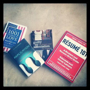
1. You must find a picture that not only fits your blog/website’s vibe, but one that is visually appealing, clean (you don’t want it too busy) and full of colors that you can build your site around. So, let’s say that I was going to create an agent blog. I’d select this picture I took that showcases the first four books I did as an agent:
 2. Open the picture in whatever design program you have or know how to use. All I have is Microsoft Paint (this comes standard with any PC). So that’s what I use.
3. You will have to cut the image down to fit the masthead space. Mastheads are rectangular, so I’m going to use a cropping tool to cut out what part of the picture I want to keep…and remember to leave plenty of room for your text! (The arrows in this image show you where I got the cropping tool and also what the box looked like after I’d dragged it across the image. The box denotes the part of the picture that I was cutting out).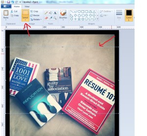
4. Right click on the cut out image and copy it into a new Paint document.
5. Resize the image. For the template that I use on Blogger, it’s best if my masthead is 892×353 pixels. Otherwise, it’s off-center or skewed. So that means I need to adjust the size of my image. Now, I can’t just stretch it, otherwise it will get fuzzy. So I have to use the resizing tool. If I type in 353 as the vertical height, it will automatically adjust the entire image. But now I have an image that is the right vertical length, but not the right horizontal length.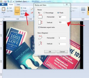
6. Do what you need to do to get it sized right. For this photo, I’ll add some black to the sides until I end up with the correct-sized image. For your image, you may need to play around with the resizing tool until you figure out what will work. It’s going to be different for each picture. So you’ll need some patience. But here’s what it looks like to add a chunk of solid color:
A) First, you must stretch the white box. (That’s your working space).
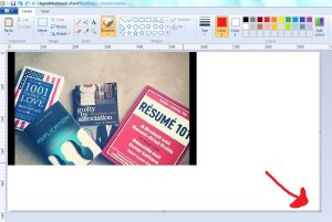 B) Using the “Select” tool (which is the same tool we used to cut the image in step 3, drag the box around the image, then move the image to the top cent of your white space. Select the paint can button and select your color for the background. I chose black.
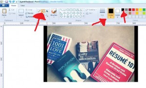 C) Move the paint can to the white space and click. It will automatically color the space behind your image. Using the “Select” tool again, cut out your image, leaving plenty of space on both sides. Right click, cut, and paste the cut-out image into a new Paint document. Adjust the white space so that you can no longer see it.
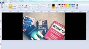 D) Cut the sides down until you’ve achieved the desired pixel count. (If you use the Select Tool and highlight the space, it will give you a pixel count). When you have
7. Using the “Text Tool” create a text box where you want your text to go.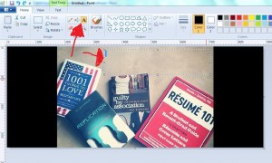 8. Select the font, color, and size you want, and type your text in. Be sure to have “Transparent” selected.
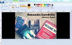
9. And there’s your masthead!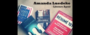 10. You’ll have to figure out how to put it on your blog…but that’s another post for another time.
Would love to hear your feedback and thoughts! And if you have an easier way of doing this, please share.


20 Comments
Amanda, Great step-by-step instructions. I use paint a lot to turn images I created in Word into jpgs, but haven’t bother with the resizing feature. I’ll definitely be trying it out now. 🙂
Thanks!
I have been following you here (on Chip’s blog) since you joined MacGregor Literary and never knew you lived in Indiana! I grew up about 40 minutes outside of Fort Wayne in a nifty little map-dot called Churubusco. I’m not 20 minutes outside of Manhattan, but … well, you just feel a touch more tangible now. 🙂 THANK YOU for all the great tips you offer here. Your advice is always right on target.
Amanda, I know how to do all these steps, the bigger issue is, why haven’t I? Thanks for the gentle nudge forward.
That IS a big issue!
Great suggestion and how to step-by-step! Thanks, Amanda!
p.s. I still do graphics on Quark XPress
Recently heard your CD from the GWCWC “Ask the Agents” segment… very helpful — Thanks again! 🙂
Amanda, I always look forward to your guest blogs. They are SO helpful! I’ve yet to blog, but intend to at some point and your tips are invaluable. I know how to use paint in a limited way, teaching myself through experimentation, but now I know a bit more I can REALLY use! I also have Photoshop Elements, which I know VERY limited things about, but oh, how wonderful these programs are! Thank you 🙂
Thanks for the kind words, Donna 🙂
Thanks, Amanda! I did it, and it wasn’t complete torture. In fact, it took about ten minutes. Not that it’s perfect, but now there’s an image of my debut novel as my masthead instead of just my boring name. Thanks!
Yay! Glad it worked out 🙂
My daughter showed me this same method. I love techy teens. Thanks Amanda!
Yep! Teens are treasure troves of social media resources.
I use Microsoft Powerpoint to fiddle with my photos. You can do a lot of formatting in it. Then, I save the slide as a picture (jpeg file), which, in the new version at least, is an option in the drop down “Save as Type” box.
That’s a good idea, Elizabeth. Back when I had a real job (you know, the kind with a paycheck?) I worked with PageMaker and Corel Draw. I miss those programs. They were so much easier to use than Paint.
I learned graphic design on Quark xpress…which is pretty much nonexistent nowadays. Funny how quickly things change.
This is a great idea!
when it comes to computers, I’m a hopeless mess. Not only was I able to follow your instructions to create my masthead, I even figured out how to apply it to my blog!! I think it looks pretty good… now if only I could find the time to blog on a regular basis! Thanks, Amanda. 🙂
YAY!!
Yay! And your blog looks so great!! Way to go 🙂
You are awesome, Amanda! I do not have tips or an easier way to do it. (I paid someone to make mine–laziness, yes.) But you’ve convinced me now that I might actually be capable of creating my own Facebook header. 🙂
Lol! It doesn’t get any easier than the Paint program 🙂