A Monday with Amanda: Book Promo Cards
 Amanda Luedeke is a literary agent with MacGregor Literary. Every Thursday, she posts about growing your author platform. You can follow her on Twitter @amandaluedeke or join her Facebook group to stay current with her wheelings and dealings as an agent. Her author marketing book, The Extroverted Writer, is available from Amazon and Barnes & Noble.
Last Thursday, I blogged about why creating STUFF doesn’t work when it comes to marketing and selling books. In the post I talk about a card that I created for my marketing book. Here’s what I said:
I have cards on hand for my marketing ebook. I give these away at conferences. It works like a gem. But the big deal isn’t that I have the cards…it’s that I’m AT the CONFERENCES. I’m pounding the pavement. And then I’m sealing the deal with the card.
Imagine if I sat home. If I had a book to promote and a bunch of cards that I didn’t know what to do with. I’d end up with TWO things to promote. Two items that need marketing plans and Twitter campaigns and Facebook strategies (though I realize the idea of a Facebook strategy for a card is a bit silly…you get my point).
One commenter asked to see an example of the card, and though I still hold firm that it is not the card that matters…it’s my presence at the conference…I figured it may be helpful to show you what info I included (and excluded) on the card.
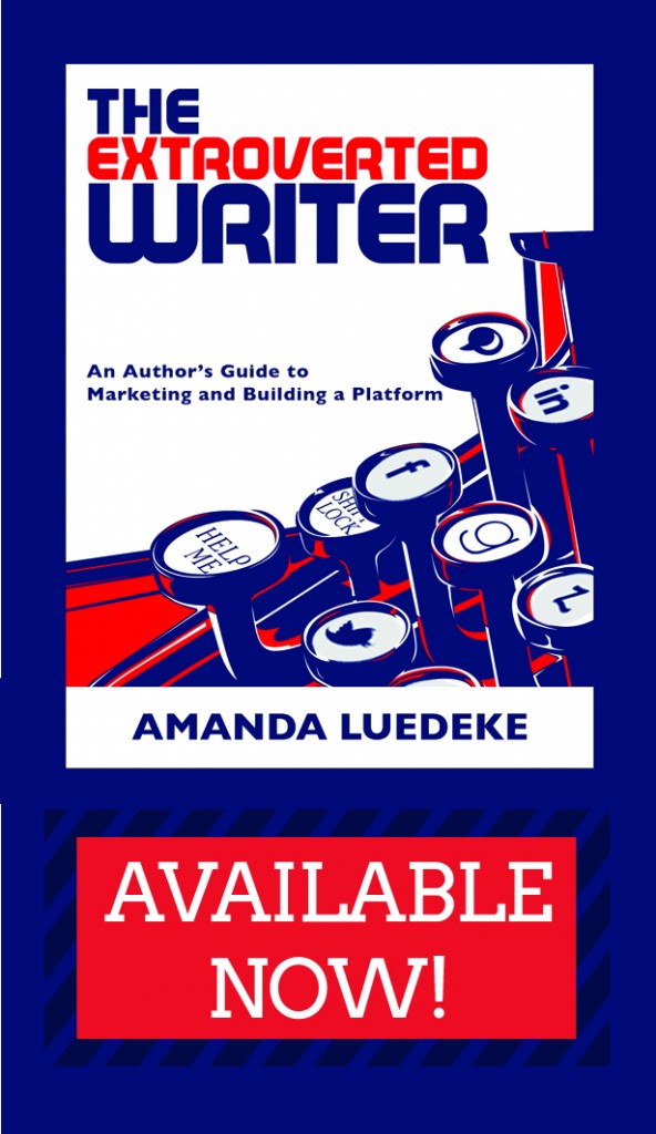
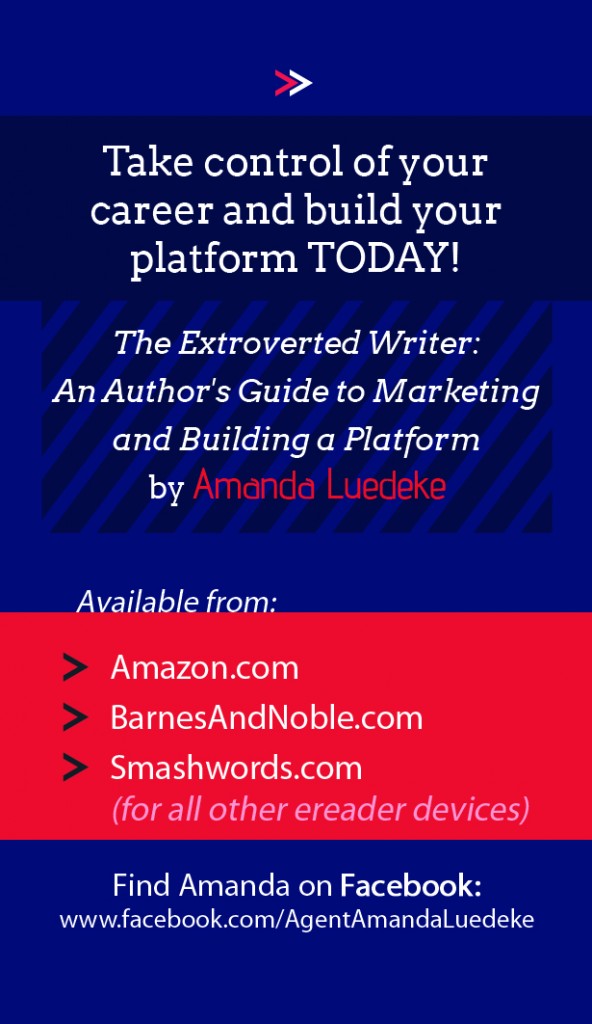
It’s a business-sized card, and it has a front and a back:
Jam-packed on this card are the following:
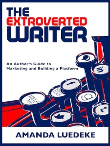
1) Cover image
2) A sense of urgency and hype in place of a blurb or endorsement (Available Now!)
3) A hook that answers a NEED authors have. I mean who doesn’t want to take control and build their platform starting TODAY?!
4) The book’s title and author name in clear, readable script (as opposed to simply relying on them to pull it off the cover image)
5) A list of where the book can be purchased (the dot coms indicate it’s ebook-only at this point…though that may be changing soon!!)
6) A way for them to connect with me.
What I didn’t put on it:
1) an author photo. While I tend to believe that my face DOES sell books, I don’t want to actually put money on it. (EDIT: So rereading this, I realized it’s not clear that I was making a joke! I was joking, people! No, I don’t think my face sells books!)
2) every single social media touchpoint imaginable. Am I on Twitter? Yes. Do I blog? Yes. But I didn’t include these, because Facebook is where I prefer to interact with authors and writers.
3) a super-lengthy description of the book. I fully realize that the card will not in and of itself cause someone to buy my book (and you’re kidding yourself if you think that YOUR card will ever on its own sell YOUR book). So it doesn’t need to make a case for my book. Instead, it simply needs to seal the deal. The catching hook is enough to remind people who were already thinking of buying my book that they should probably do so.
4) contact info. If I wanted them contacting me personally (and if they wanted to do so) I could give them a business card (or they could ask for one).

And most importantly:
1) I didn’t design this myself. I PAID someone who knows design and can do a professional job. I paid about $80 for the design and then printed through Vista Print.
2) I didn’t fill up every speck of space with text. There’s lots of things for the eye to look at. Lots of small design elements. That’s the mark of a great, well-designed card.
Alright, what questions do you have? Ask away!
And if seeing this card has maybe sealed the deal for you to pick up my ebook, you can check it out on Amazon and Barnes&Noble.com. It’s only $5.
Here’s what readers are saying: “…it doesn’t just tell you the things you should be doing. It shows you how to do those things.” – Chris Kolmorgen, Amazon Review


15 Comments
Amanda – you rock. I LOVE these cards. I’m going to conference and did NOT want to just take a business card that looked like every other card out there, and this is brilliant. I’m a little opinionated about this, but I’m with you – my face isn’t what I really want to sell. I want you to remember my books. If you want to see what I look like, Google me. Or come visit my website or twitter. Great post today. Thanks for sharing.
And now I realize that it wasn’t clear that the face comment was a joke!! Haha, oops. Gonna fix that. But yes, the point still is that a face isn’t always needed…espeically when the real estate on the print product is so limited!
Ha – NO! I totally got the joke! I just thought it was still a good point, you know? That’s why I expounded on it. I see so many “realtor-like” business cards out there about the author, but i LOVE the notion of having a business card dedicated to each book – it truly is what we want to sell. Takes the pressure off putting too much info on one tiny space, too.
Phew!!! 🙂 Yes, I agree that the book’s hook is more important than the author’s credentials 🙂
Great info, and btw I just downloaded your book. Am loving it so far. My question is: business cards are small. This seems like a lot of info to put on a business card. Did I misunderstand the size? I’ve seen some authors use what they call book plates for this purpose (which is what I use to call a bookmark). Your thoughts?
This is a business card, and the content actually looks great and not crowded at all. I did consider the bookmark route, but I feel that it’s a lot easier to hold on to a business card (I mean at conferences, you’re collecting business cards like crazy, so why not throw this in the mix?!), whereas a bookmark may get discarded or misplaced since it doesn’t easily fit with anything else. Just my two cents, but who knows?!
I agree. I have misplaced bookmarks, but seem to find a way to store the business cards. Thanks for this great idea.
Great idea. So how does this apply to fiction writers? I don’t attend that many conferences, and even when I do, I’m surrounded by other fiction writers, many of whom would also like to sell their books. Like you, my book is e-book only, and I’m really struggling to figure out how to market it and the one that releases next month.
I finally started reading your book yesterday. Maybe the answer’s in there somewhere. But I wouldn’t mind a hint. 🙂
I almost wonder if a rack card might work better for fiction? That way you could get the cover and story hook on the front and the back cover blurb and maybe a good review on the back. The bigger size might grab attention too. Our chapter did rack cards for the ACFW conference, and we printed them through Vista Print. Got a great deal through them.
Thanks for sharing, Amanda. Guess I’m more of a visual learner. I completely get what you mean now.
I share Robin’s question. I see postcard-sized promos for fiction books, but I don’t tend to pick up and keep any too large to carry in my shirt pocket. (Might be different if I were a woman with a purse.) So, I wonder whether a business card size would be equally effective for fiction?
Lots of good thoughts here and questions.
Okay, my opinion is that it’s even harder to make these printed materials work for fiction. The reason my card works is because I go to conferences. and conferences are FULL of my target readership. However, you go to a conference as a fiction writer, and you aren’t rubbing shoulders with readers; you’re rubbing shoulders with the competition. So I would only put together a print material item like this if I were to go to a reader conference, like RT Booklovers. And at that point, I’d try to give it some sort of incentive, even if it’s just a coupon QR code or something.
this is a great looking card, Amanda 🙂 The colors, of course, especially with the blue background, are wonderful, but the diagonals really help add interest and make things pop without interfering with its overall readability. Great stuff! 🙂
Great advice as always, Amanda. I like the simple approach to your card.
I was just playing around on a website last week and felt frustrated trying to design something like this. My book releases in February, and I was hoping to send postcards to librarians, targeting mostly private and Christian schools.
Since the postcards would go to librarians in hopes they’ll buy it for their school library, should I add a short blurb/summary of the book?
Since I would have to mail them, my space on the back would be even more limited. So, everything I tried looked really crowded.
Thanks for your time!
Hmmm…I’m not sure this would be effective if sent through the mail. I mean the only reason it works for me is because I’m there, peddling it in person. And as a former marketer, I am reminded of the truth that if 1% of people on your mailing list reply, then it is considered a success. Ugh, that’s a miserable number! So I would suggest going to Goodreads and hitting up librarian chat groups. Ask them what works. What attracts them to a new book or author. What are they likely to respond to. Essentially, you’d need to conduct good old focus group research! I think you’ll come away with ideas of what is most effective with librarians, and it will save you money.
What’s sad is that I am a school librarian and I don’t know how to reach librarians outside of my district! Haha! But, as a public school librarian, I have a lot more resources for finding books than private schools, which usually have strict catalog development guidelines as far as content goes. So that’s why I thought it may nice for private school librarians to get a recommendation via mail of a clean, Christian YA for their school.
I’ll look on Goodreads for sure. I appreciate your time. 🙂